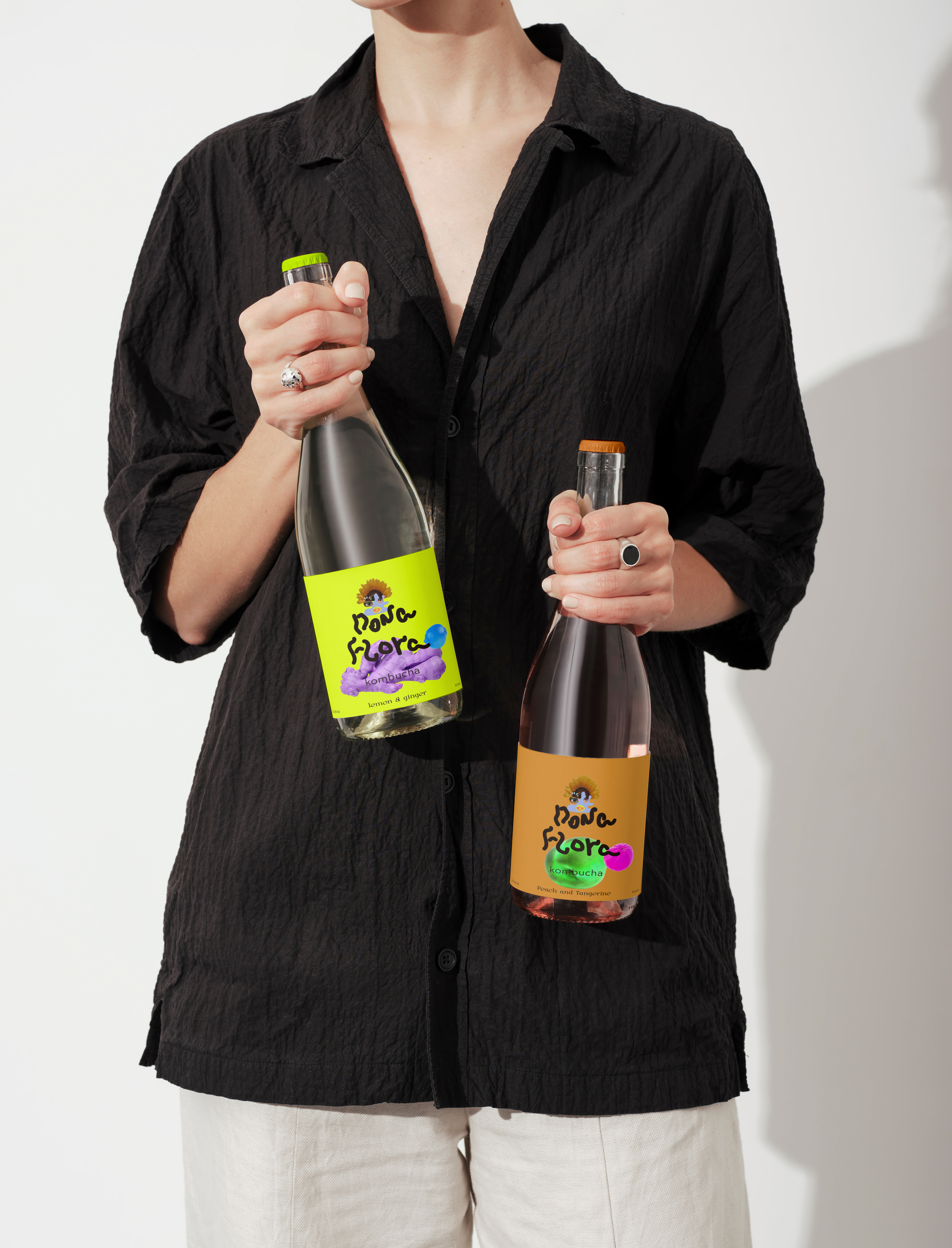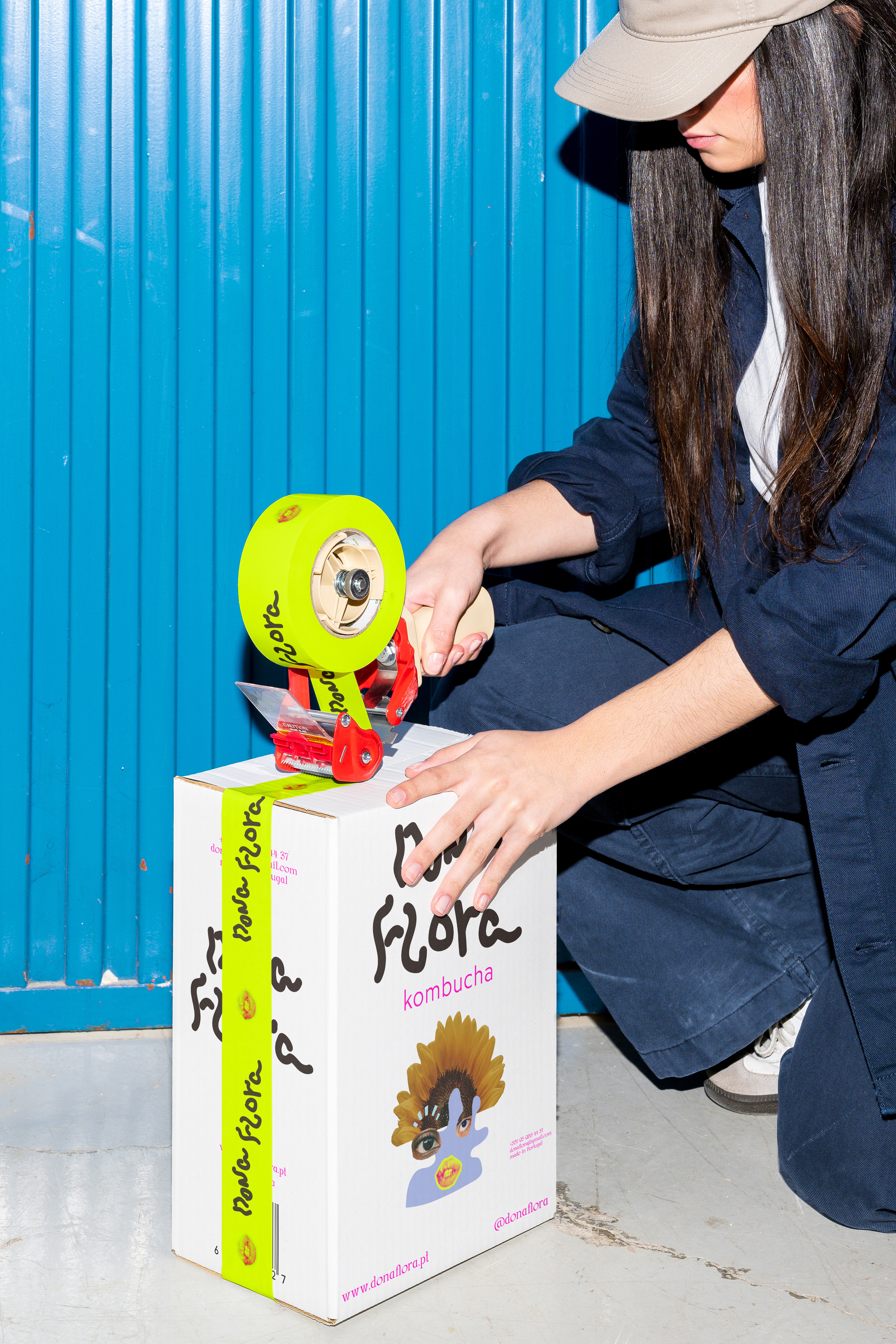

We believe that great design is more than just visual—it's an experience that tells a story. When we set out to create Dona Flora Kombucha, our vision was to craft a brand that’s as vibrant and full of life as the drink itself.
Dona Flora Kombucha is not just a beverage; it’s a celebration of wellness and creativity. Drawing inspiration from the natural beauty of the human gut—where true health begins—we designed a brand identity that’s bursting with colour, energy, and artistic flair. The hand-crafted typography echoes the intricate twists and turns of the digestive system, symbolising the journey of nourishment and vitality that kombucha offers.
Our approach to Dona Flora was to create something that feels alive, something that resonates with people who value both aesthetics and wellness. The bold collages and dynamic visuals were carefully crafted to reflect the product's natural, organic roots while also capturing the fun and effervescent spirit of the drink.