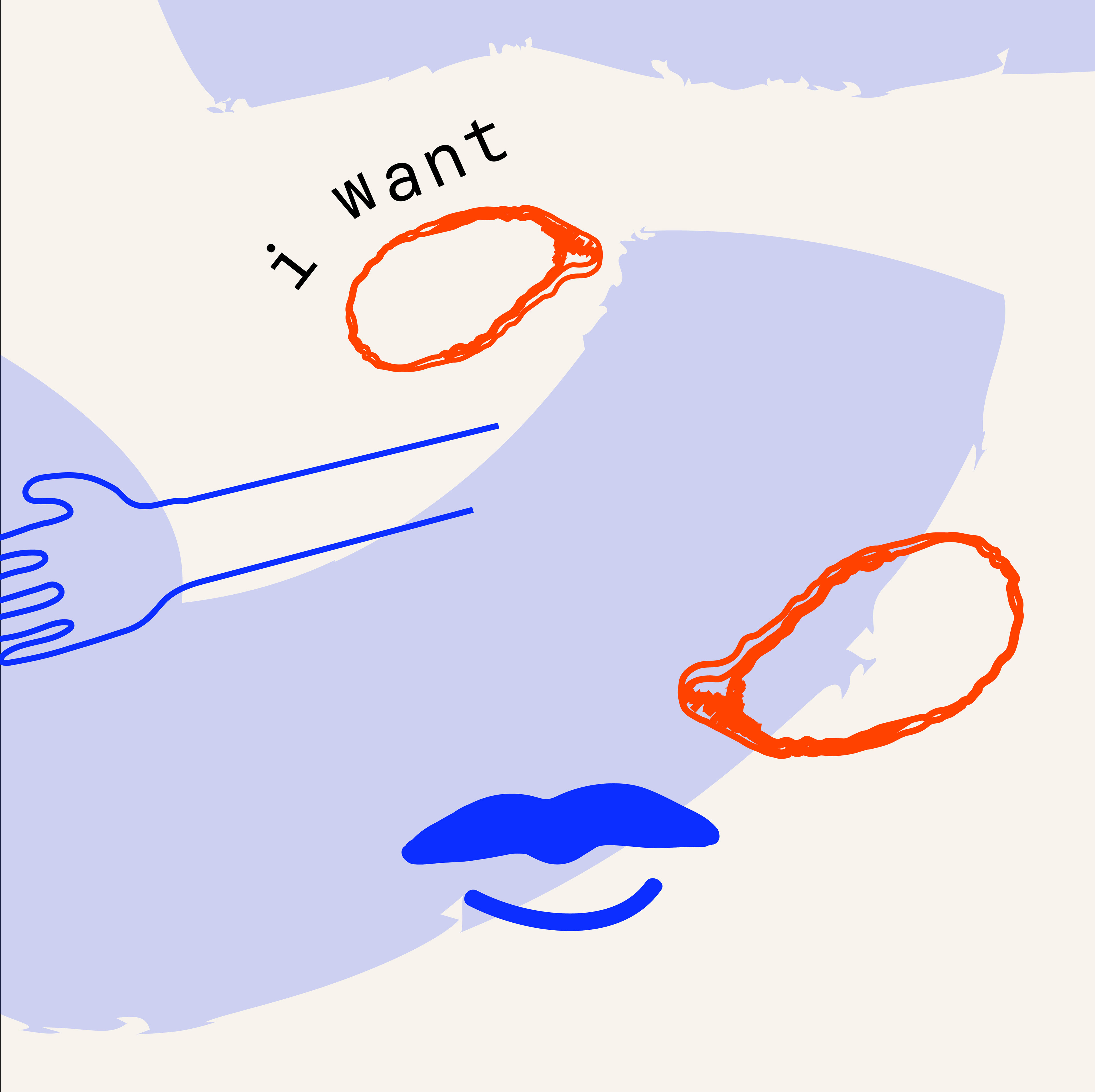

Oyster Point, is a branding identity and illustrations, combining strong colors, an illustrated logo, and a modern yet inviting brand aesthetic.
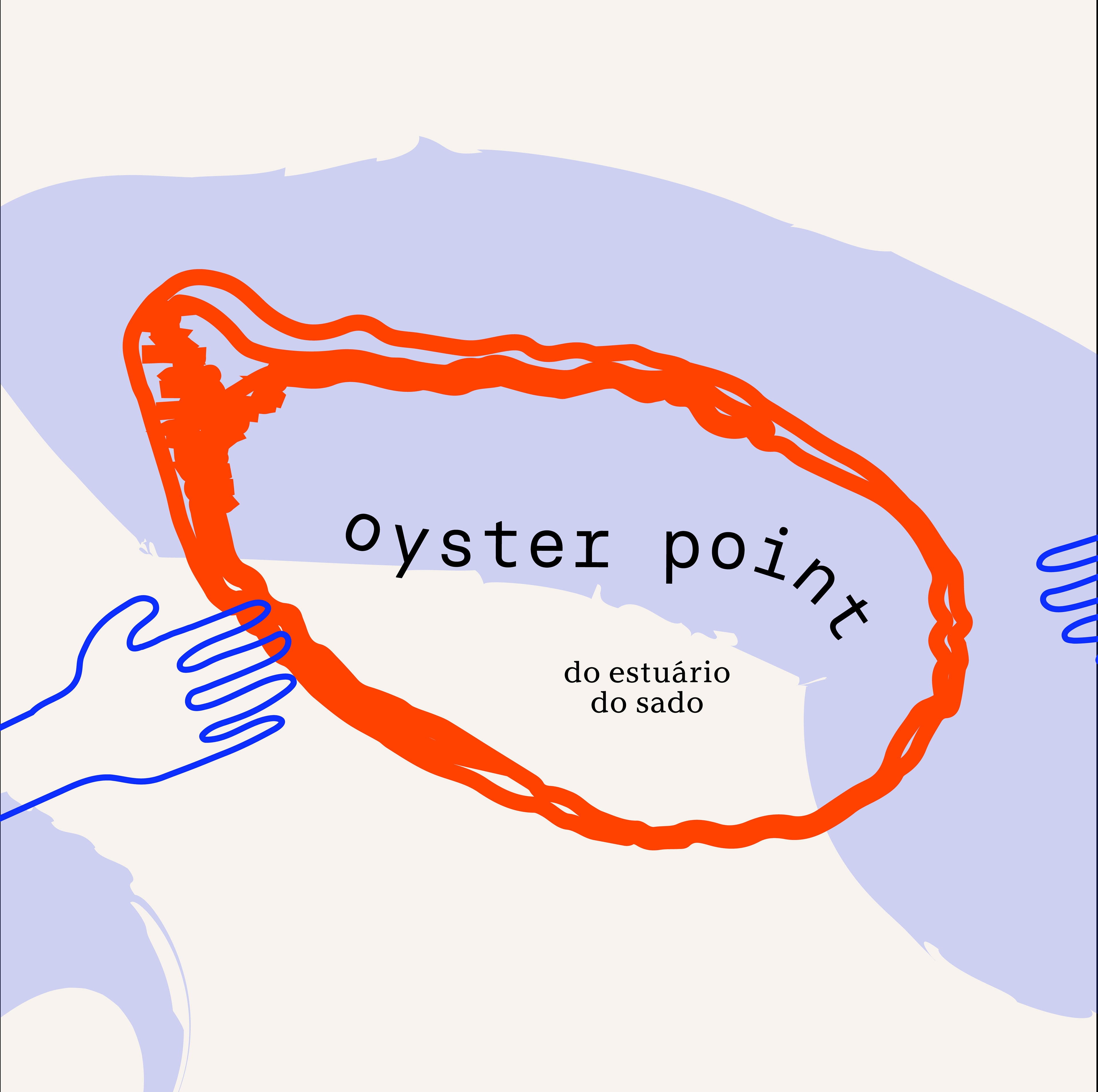
The logo of Oyster Point is a captivating and dynamic illustration that showcases the restaurant's identity. It features a stylized oyster shell rendered with bold, sweeping lines and vibrant colors. The use of strong, eye-catching hues like electric blue, and fiery orange, adds a sense of energy and excitement to the logo. The typography is modern and sleek, representing Oyster Point's contemporary approach to seafood dining.
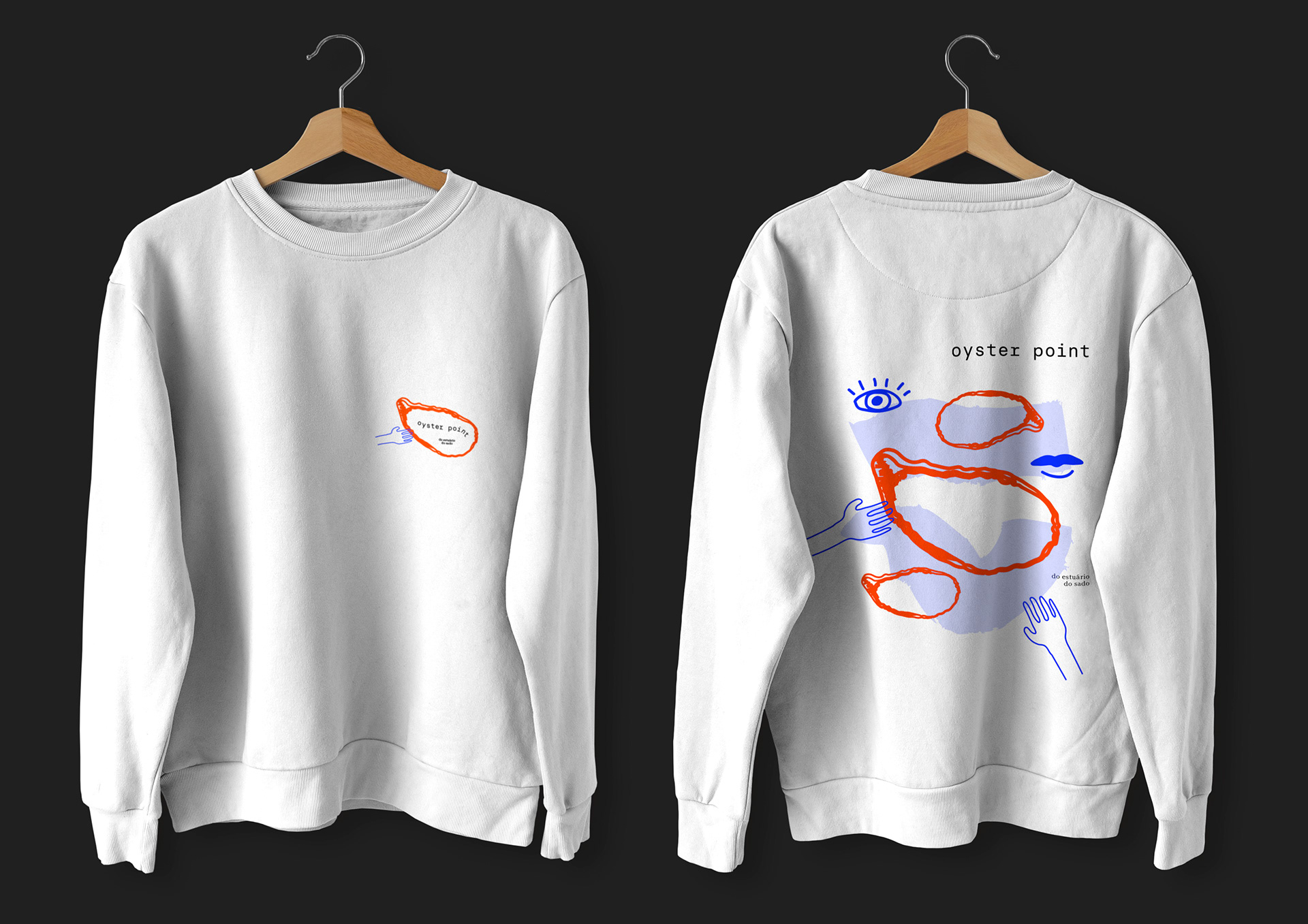
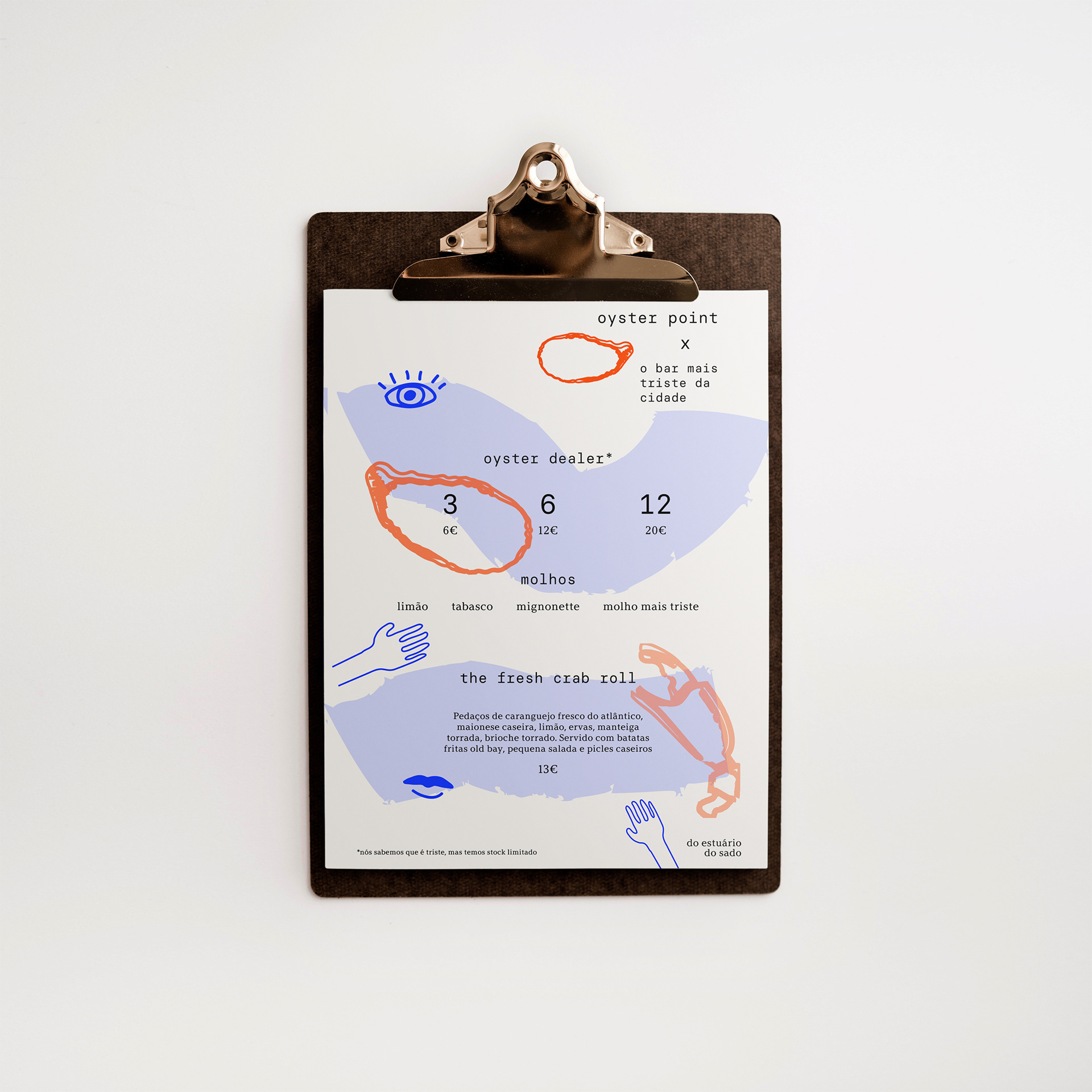
Overall, the new branding identity and illustrations for Oyster Point deliver a bold and fresh visual identity. The strong colors, illustrated logo, and cool brand aesthetic create an enticing and modern experience for customers. Whether displayed on menus, signage, or promotional materials, the branding identity and illustrations of Oyster Point leave a lasting impression, reflecting the restaurant's commitment to providing a tasty and memorable experience.
The logo of Oyster Point is a captivating and dynamic illustration that showcases the restaurant's identity. It features a stylized oyster shell rendered with bold, sweeping lines and vibrant colors. The use of strong, eye-catching hues like electric blue, and fiery orange, adds a sense of energy and excitement to the logo. The typography is modern and sleek, representing Oyster Point's contemporary approach to seafood dining.
Overall, the new branding identity and illustrations for Oyster Point deliver a bold and fresh visual identity. The strong colors, illustrated logo, and cool brand aesthetic create an enticing and modern experience for customers. Whether displayed on menus, signage, or promotional materials, the branding identity and illustrations of Oyster Point leave a lasting impression, reflecting the restaurant's commitment to providing a tasty and memorable experience.