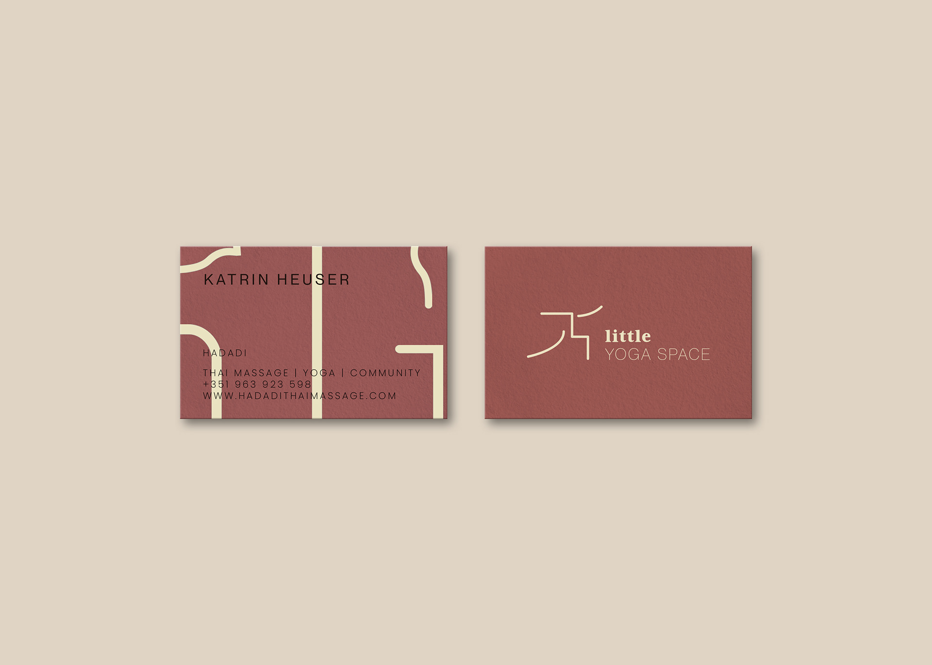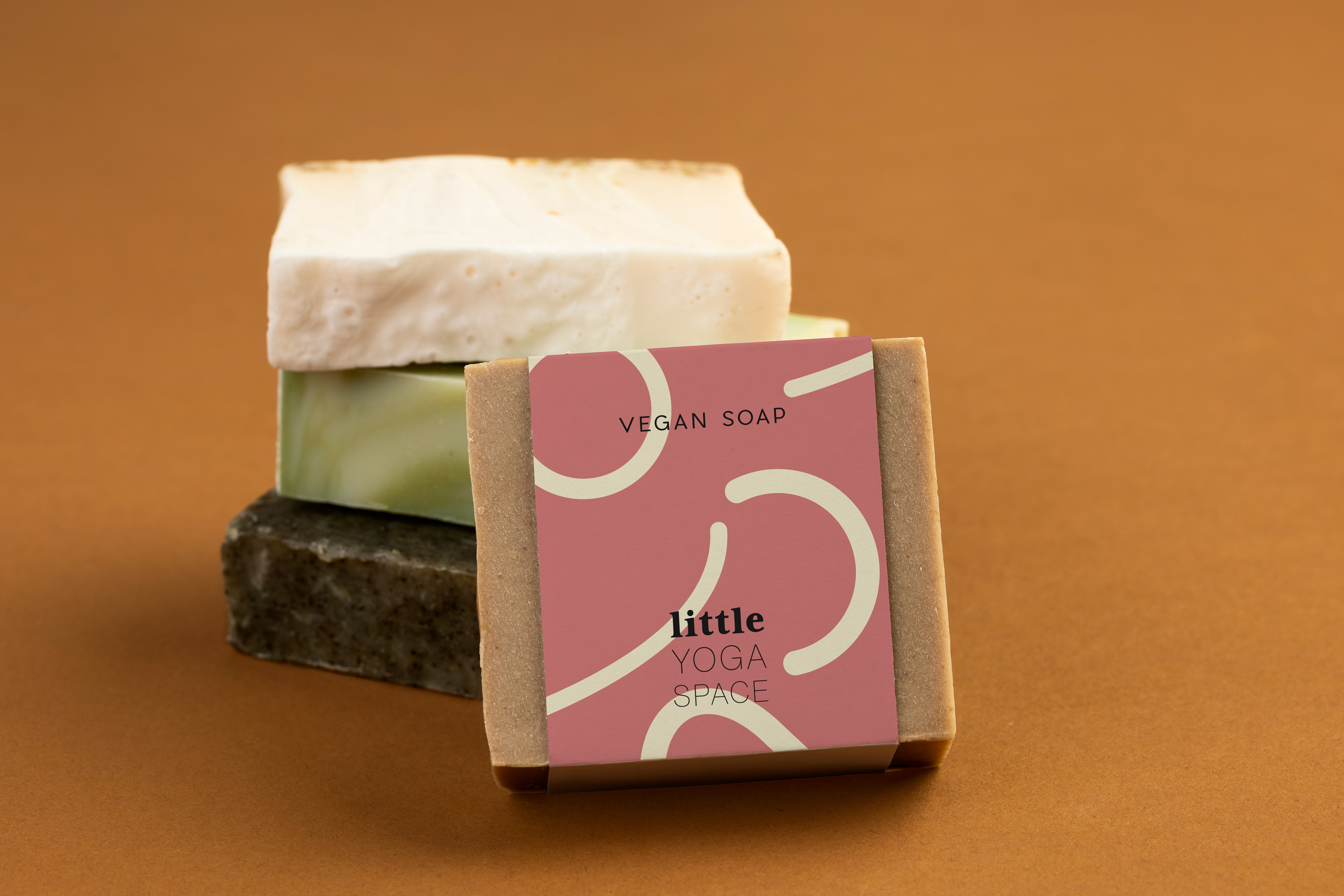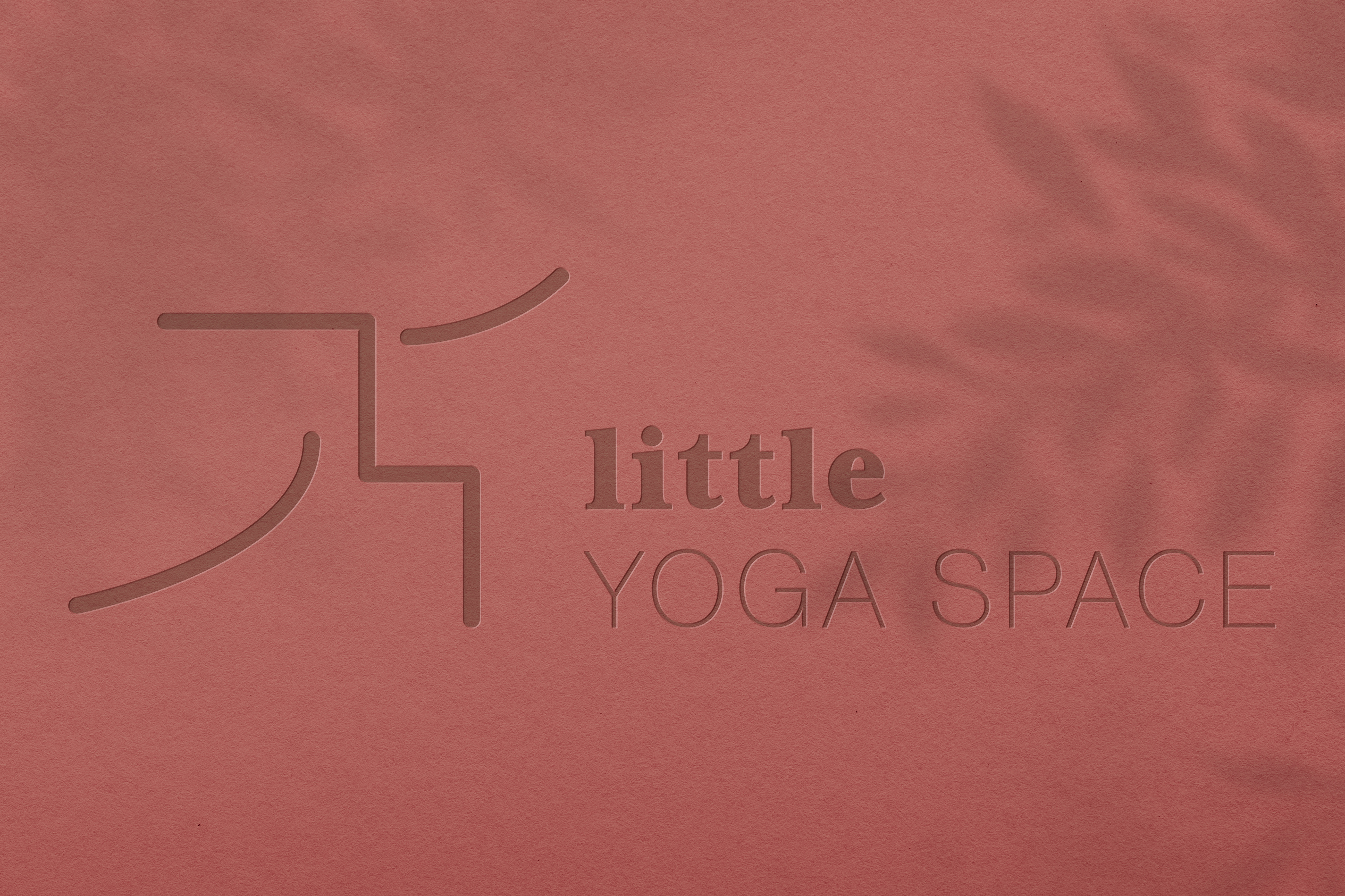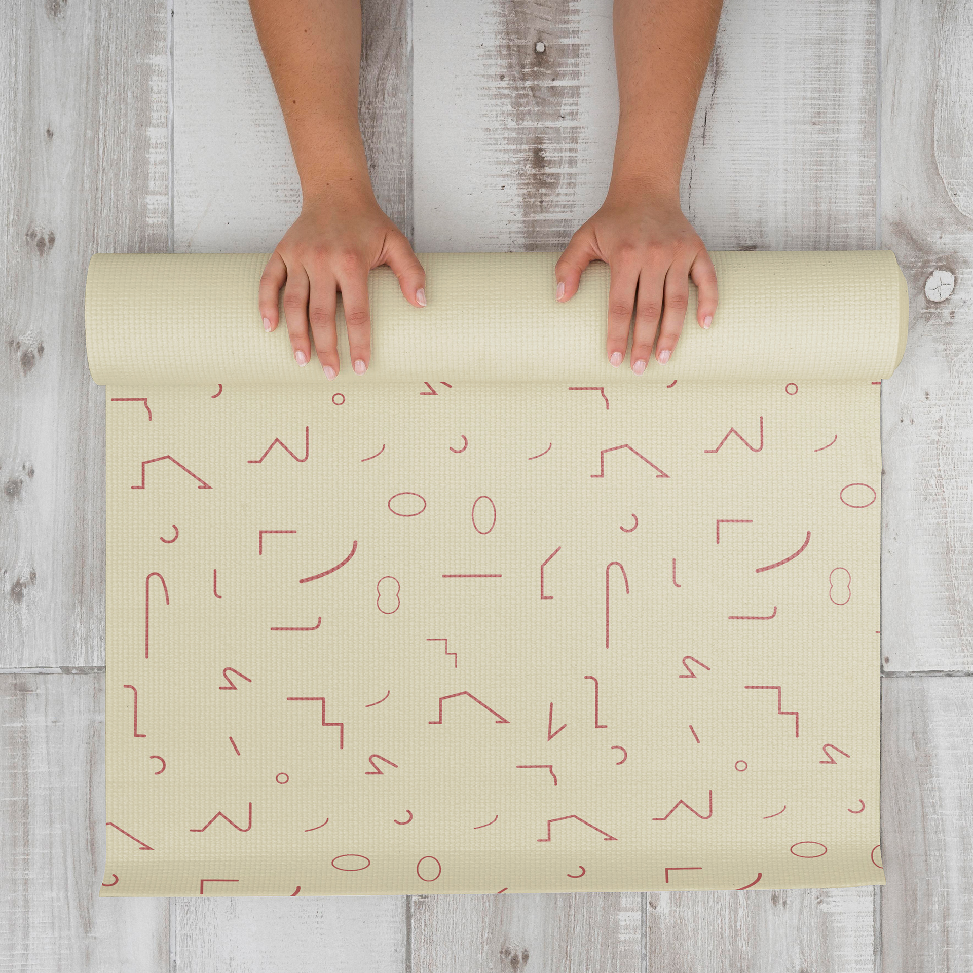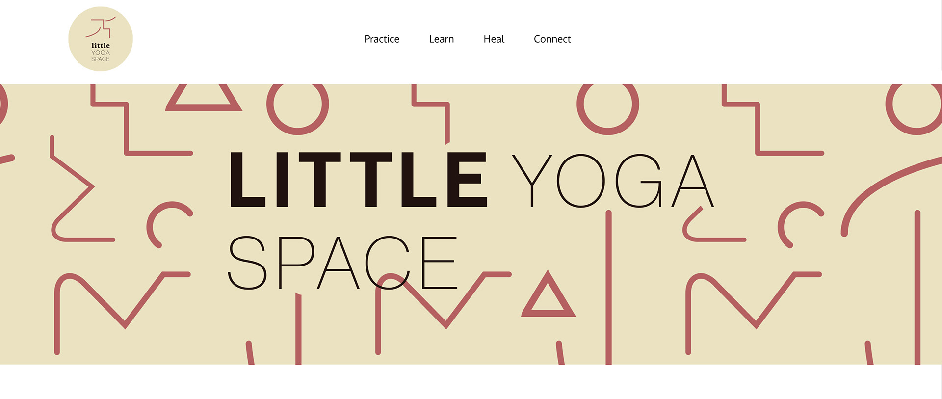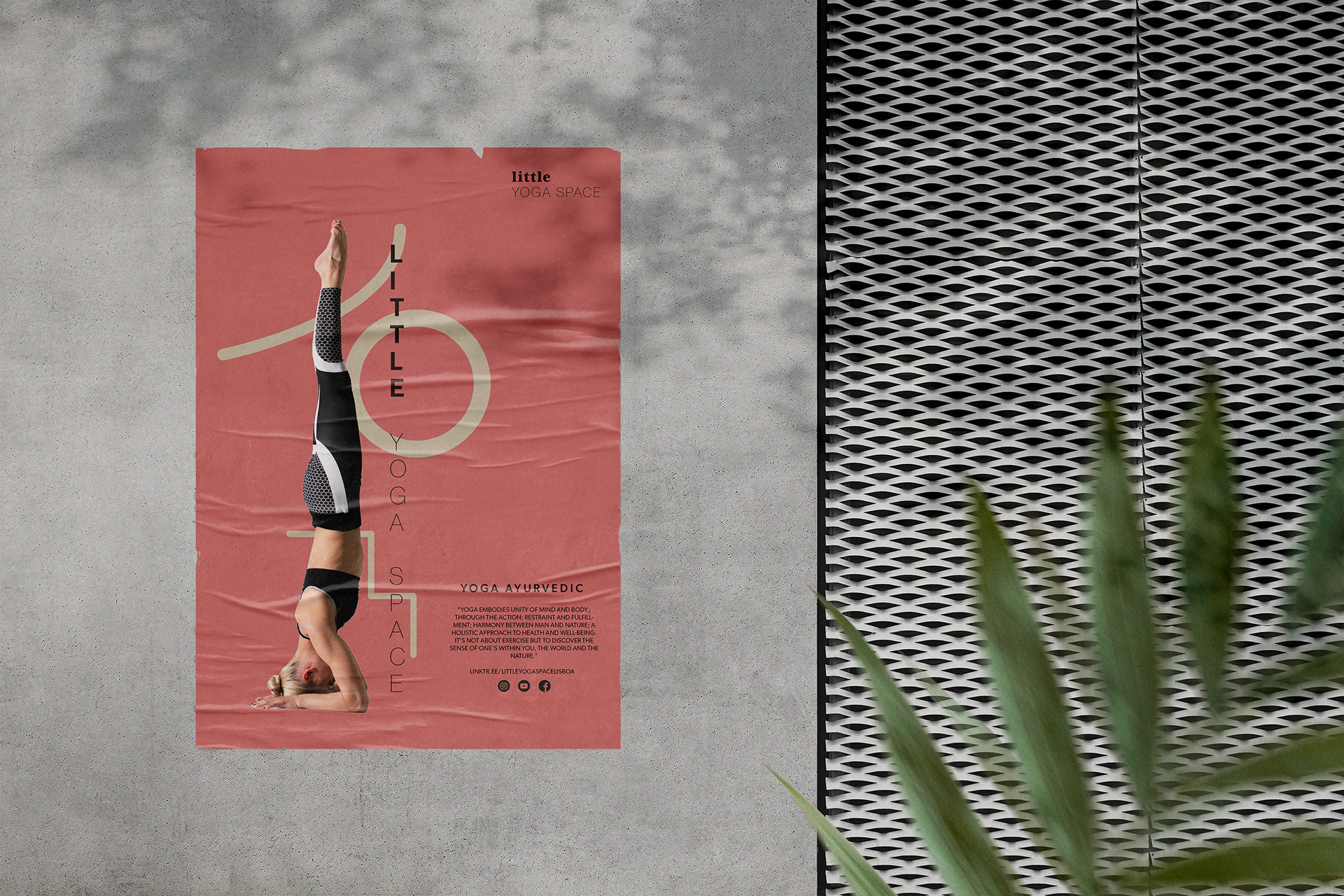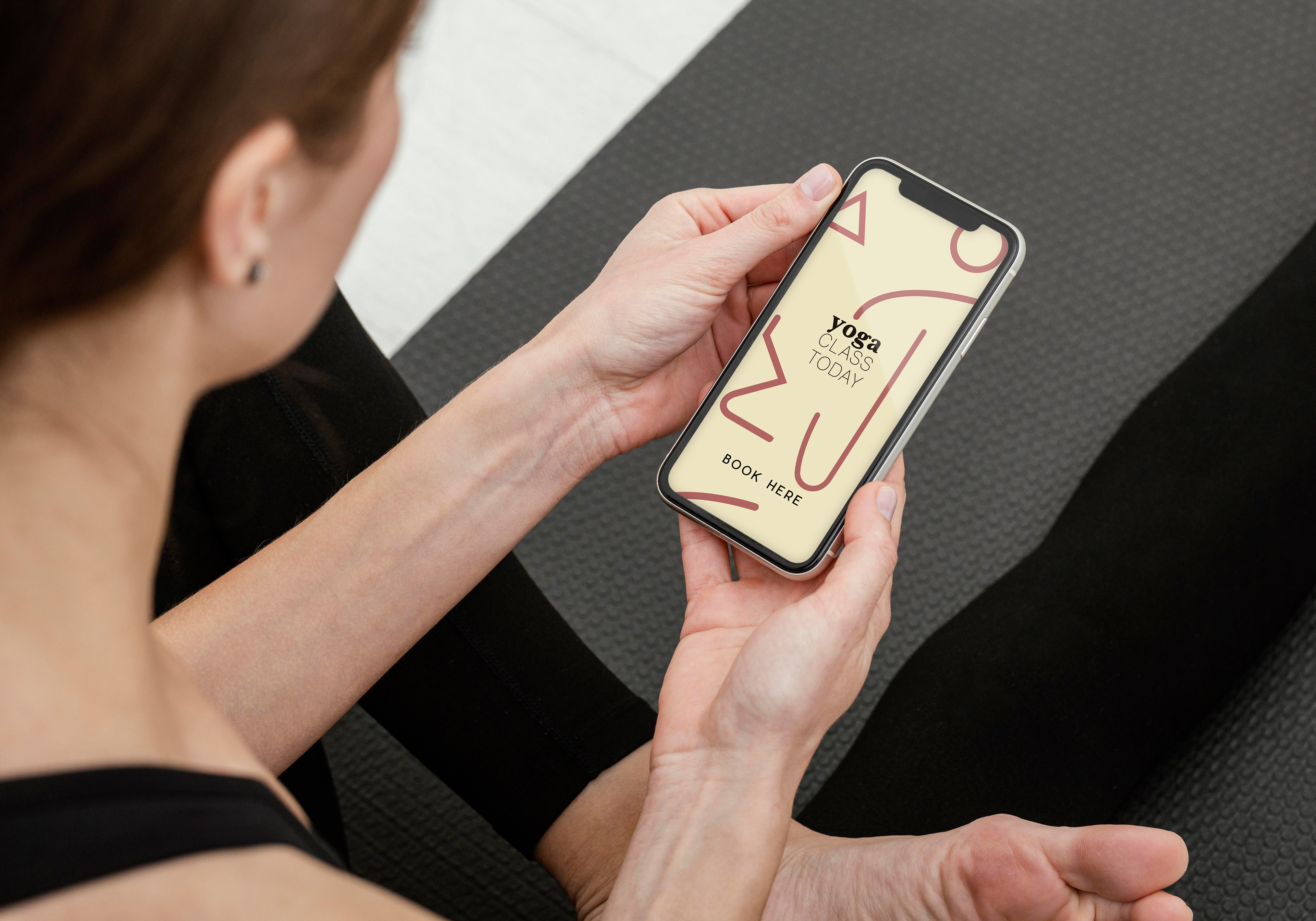
We want everyone coming to Little Yoga Space to feel welcome, safe, and comfortable enough to explore their practices. The design reflects that statement too.
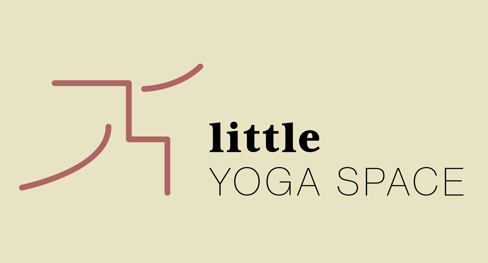
The idea of the design was to create an icon through yoga positions and with these icon patterns emerging, we tell a story that includes everyone. A shape can
be whoever and whatever we want and that message is very important in this rebranding. The patterns all together stand for the fact that no matter what shape or size you are, you are welcome at Little Yoga Space (diversity and inclusivity, and community). The different patterns don’t only Yoga poses, but could also be from other movements (the variety of our offering). In the logo, we see that they are ‘little’ but we are also quite ‘bold’.