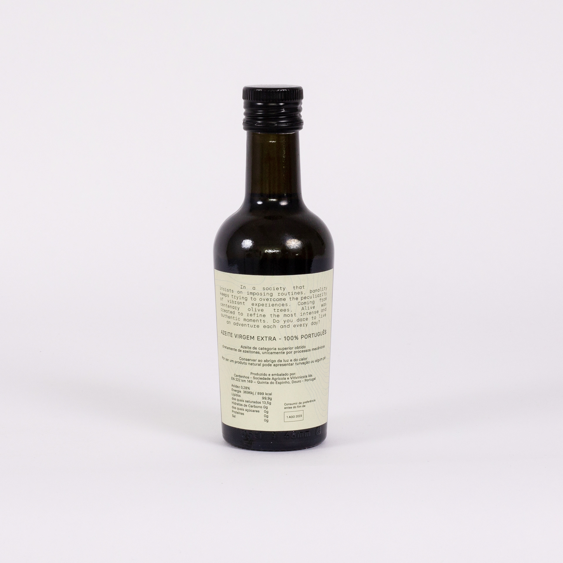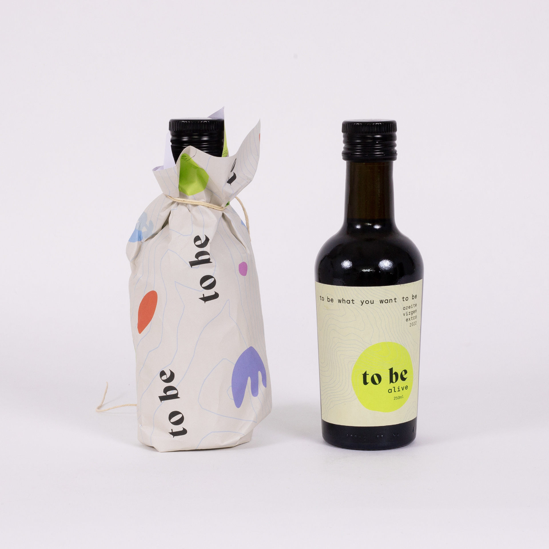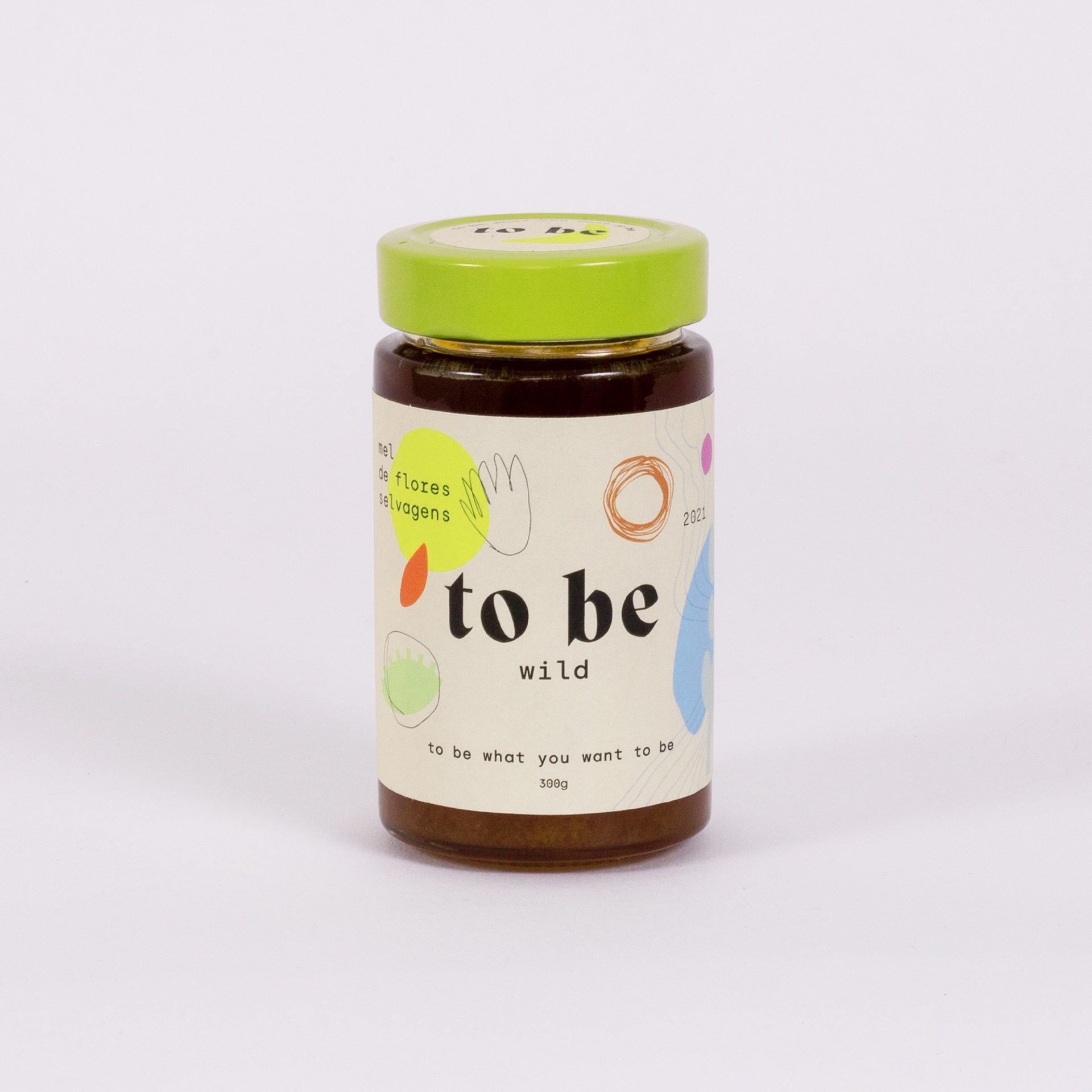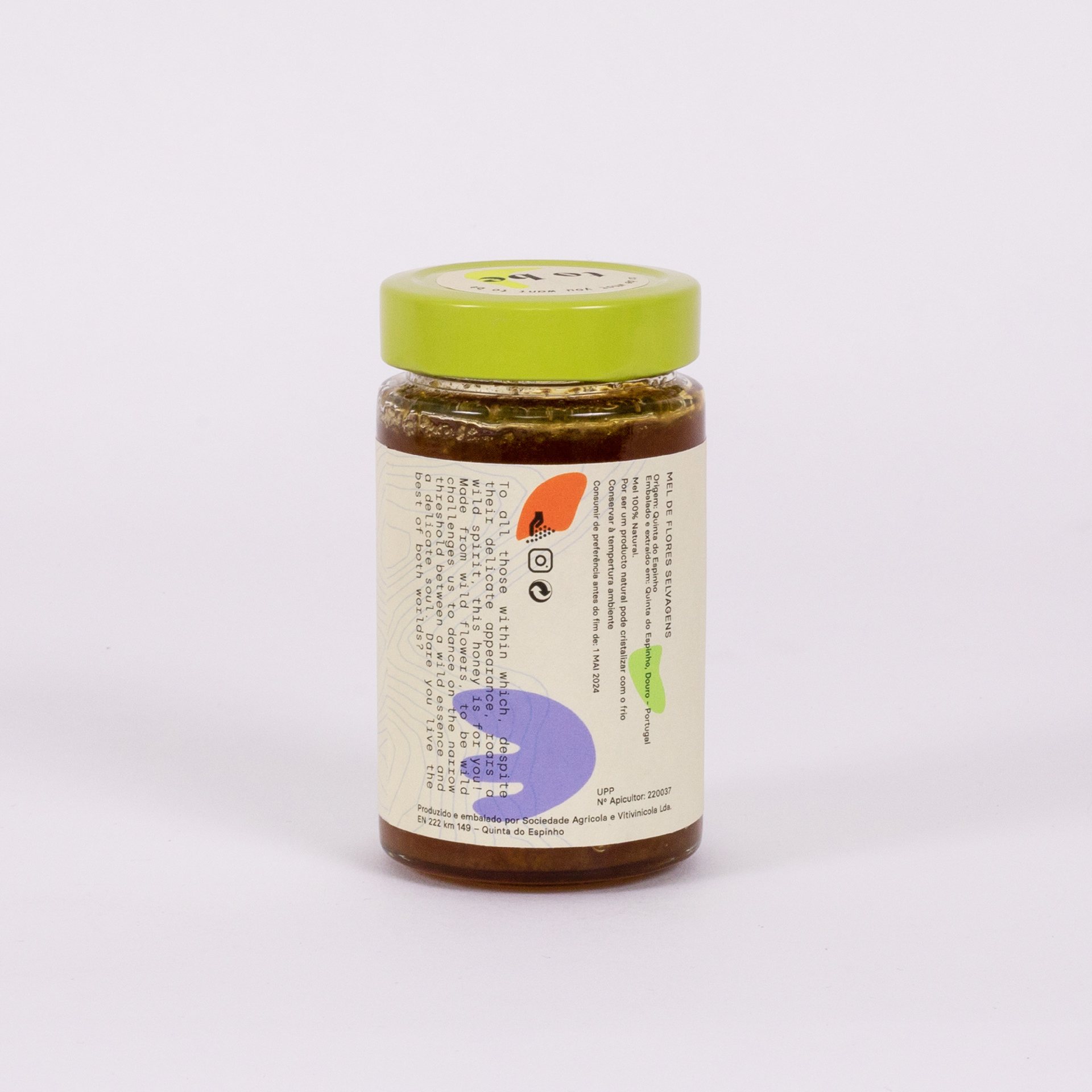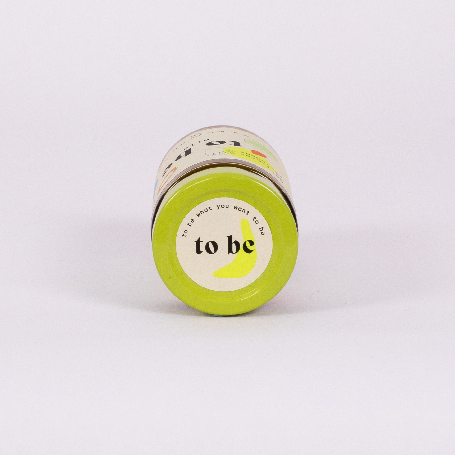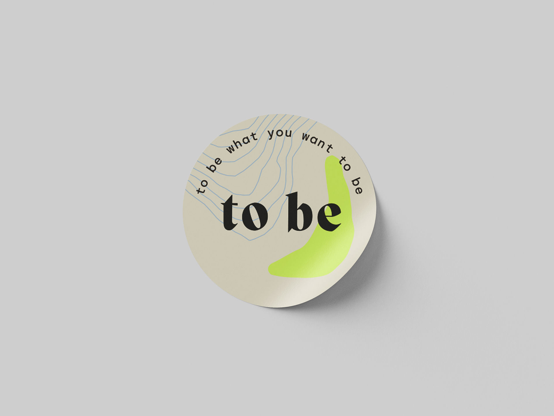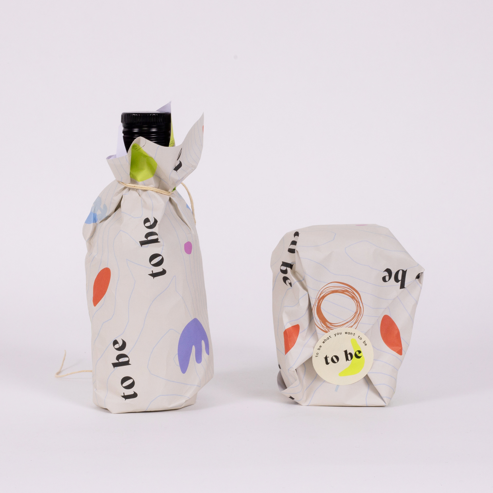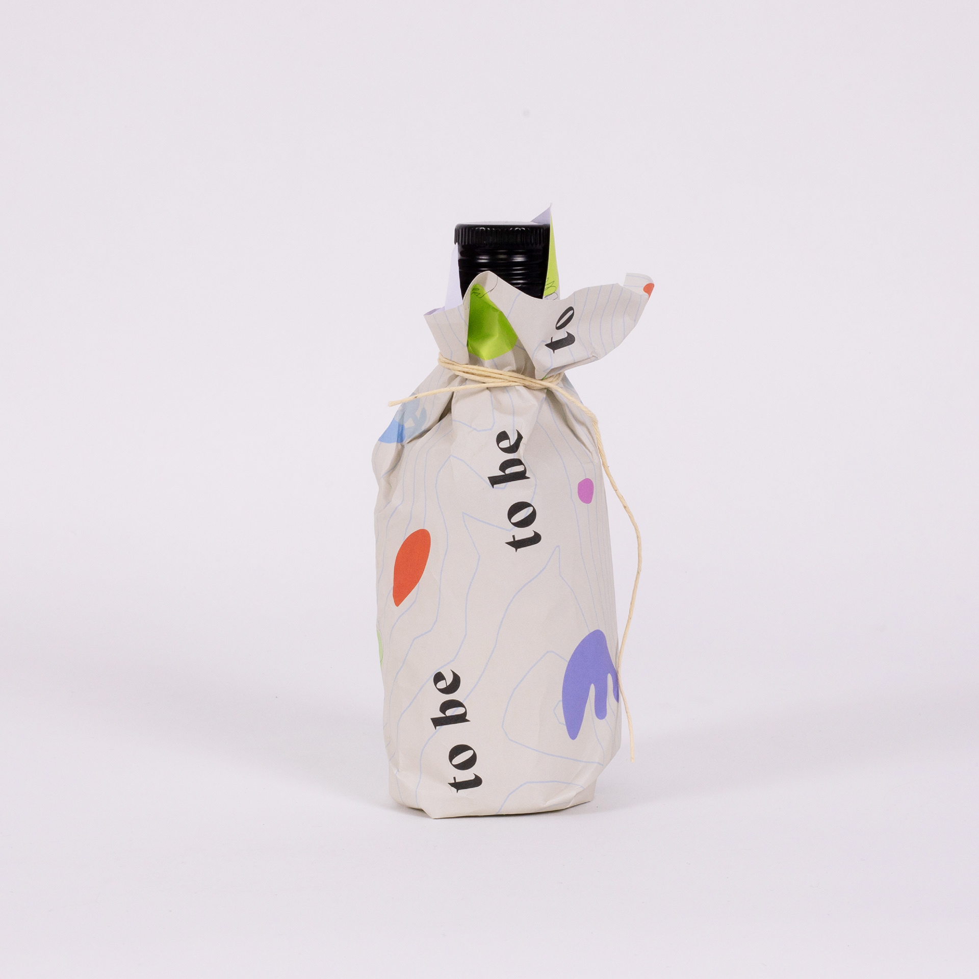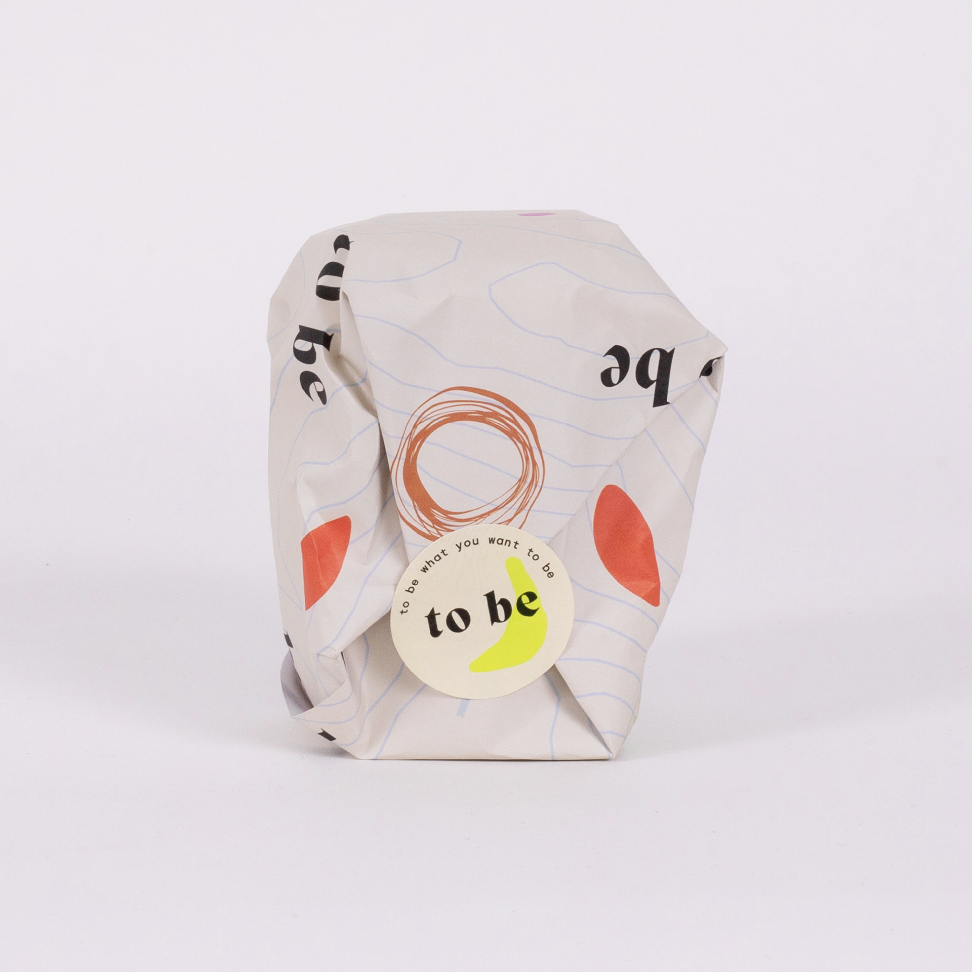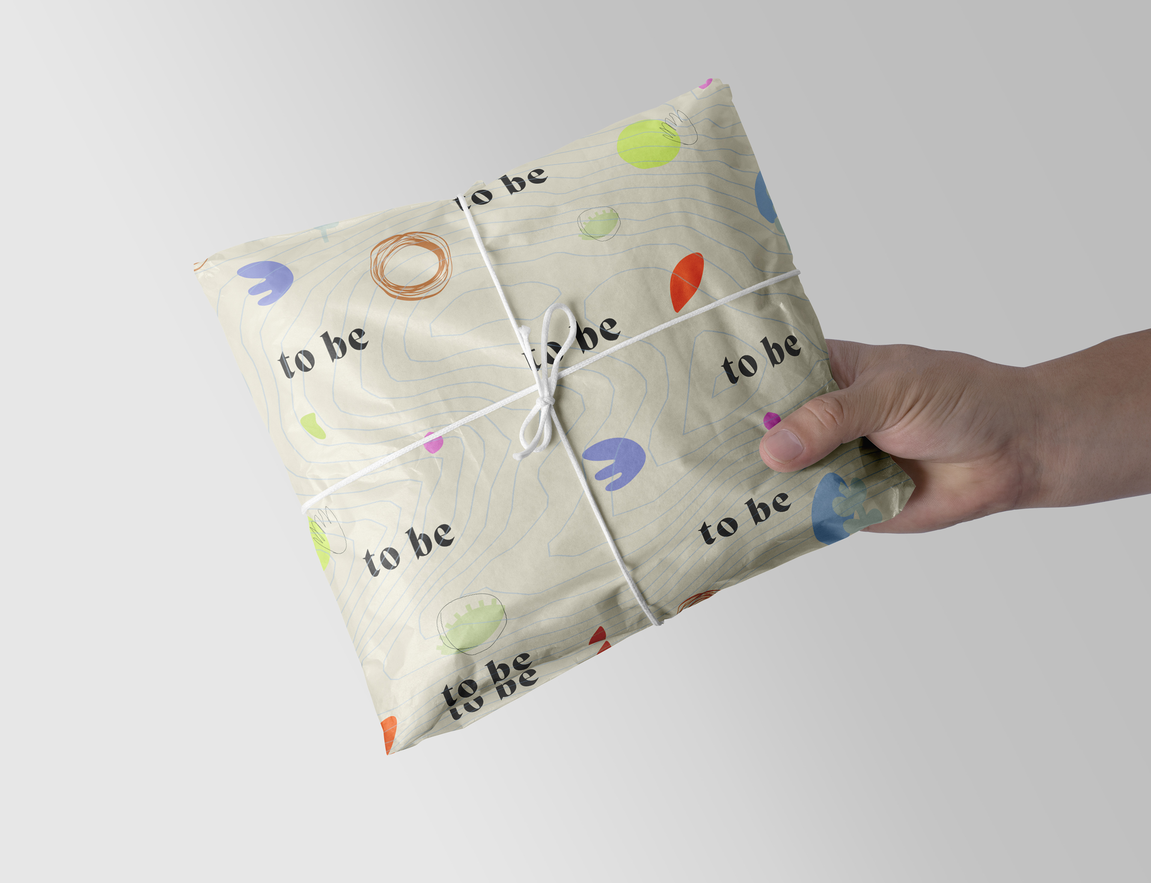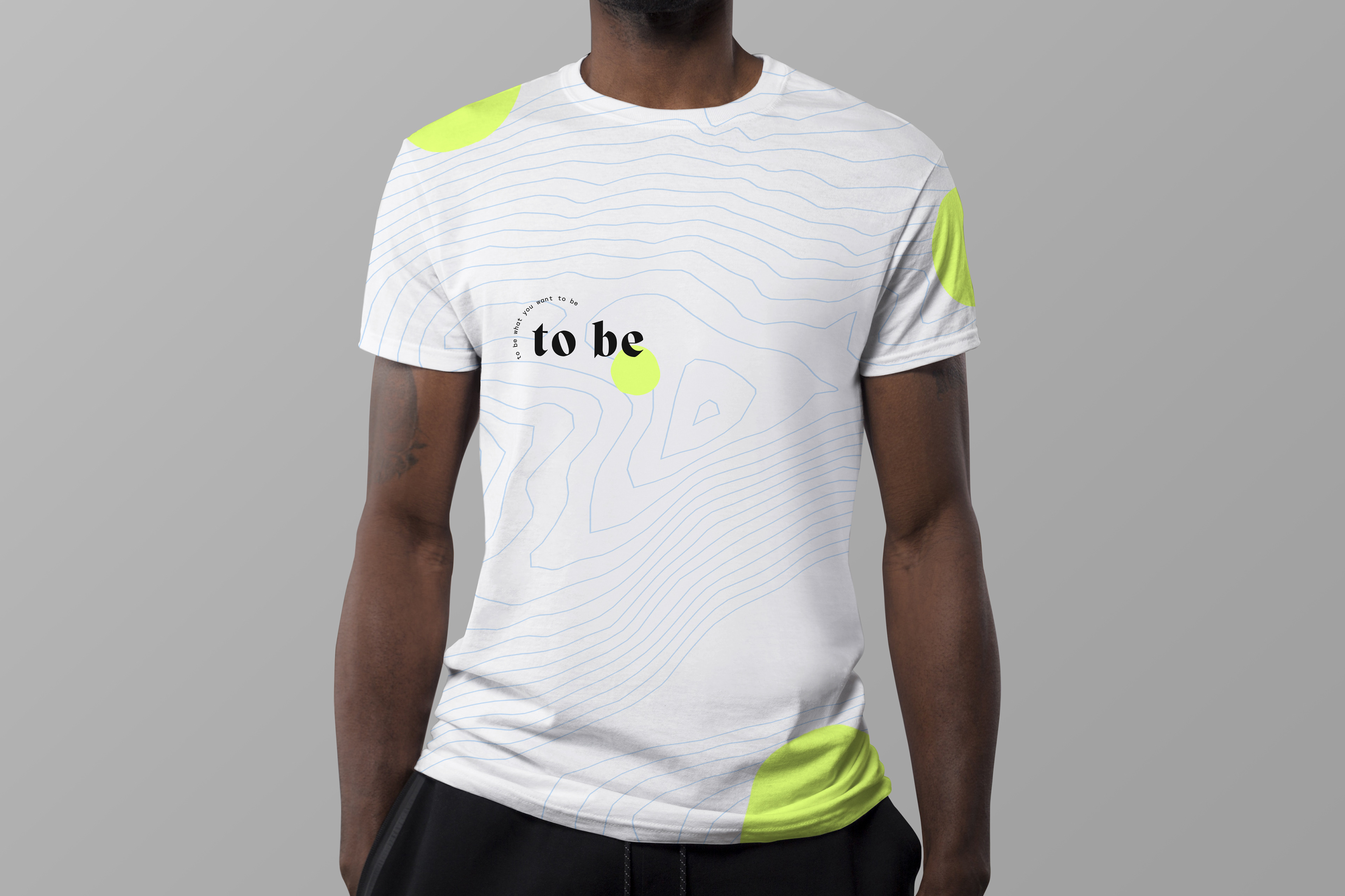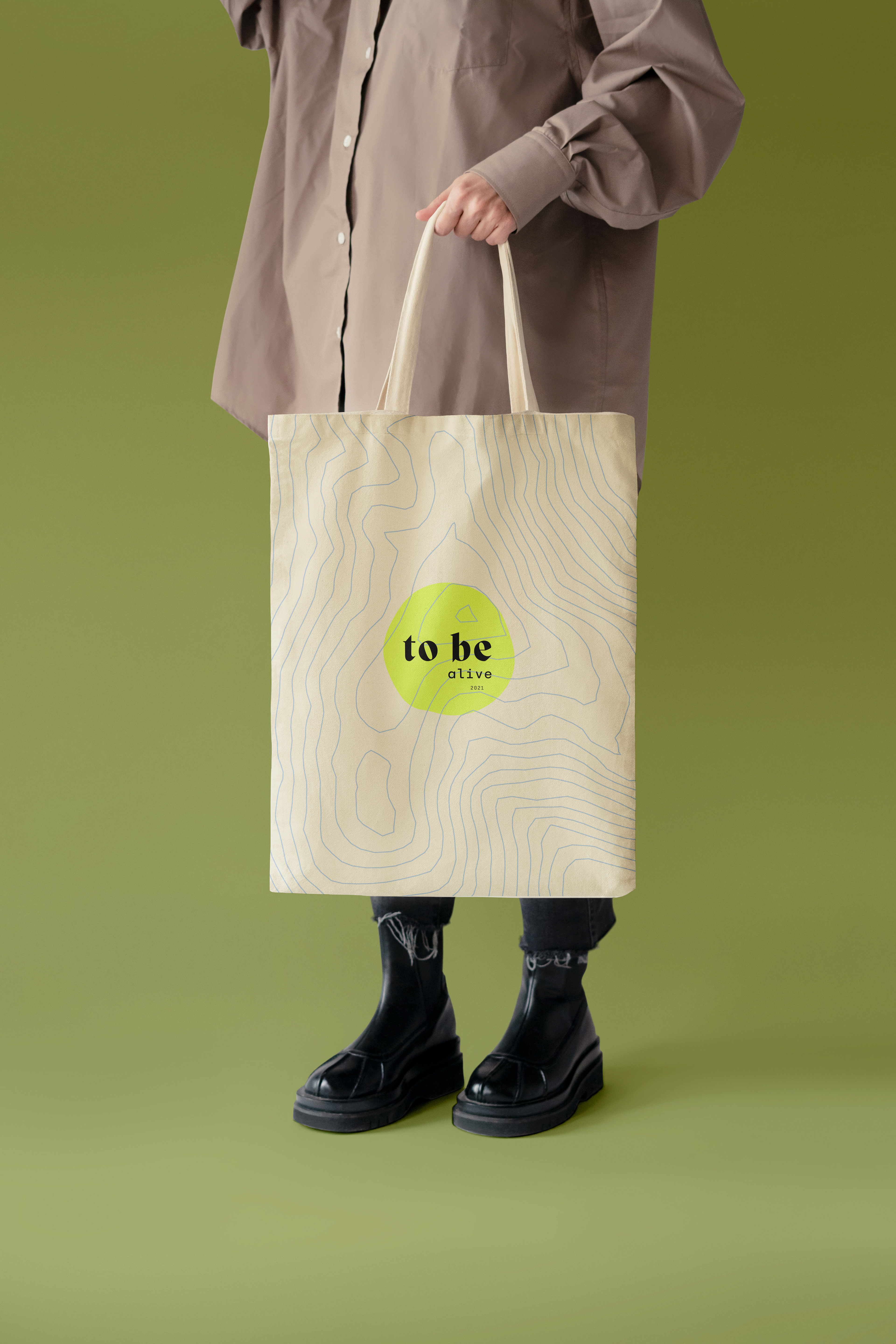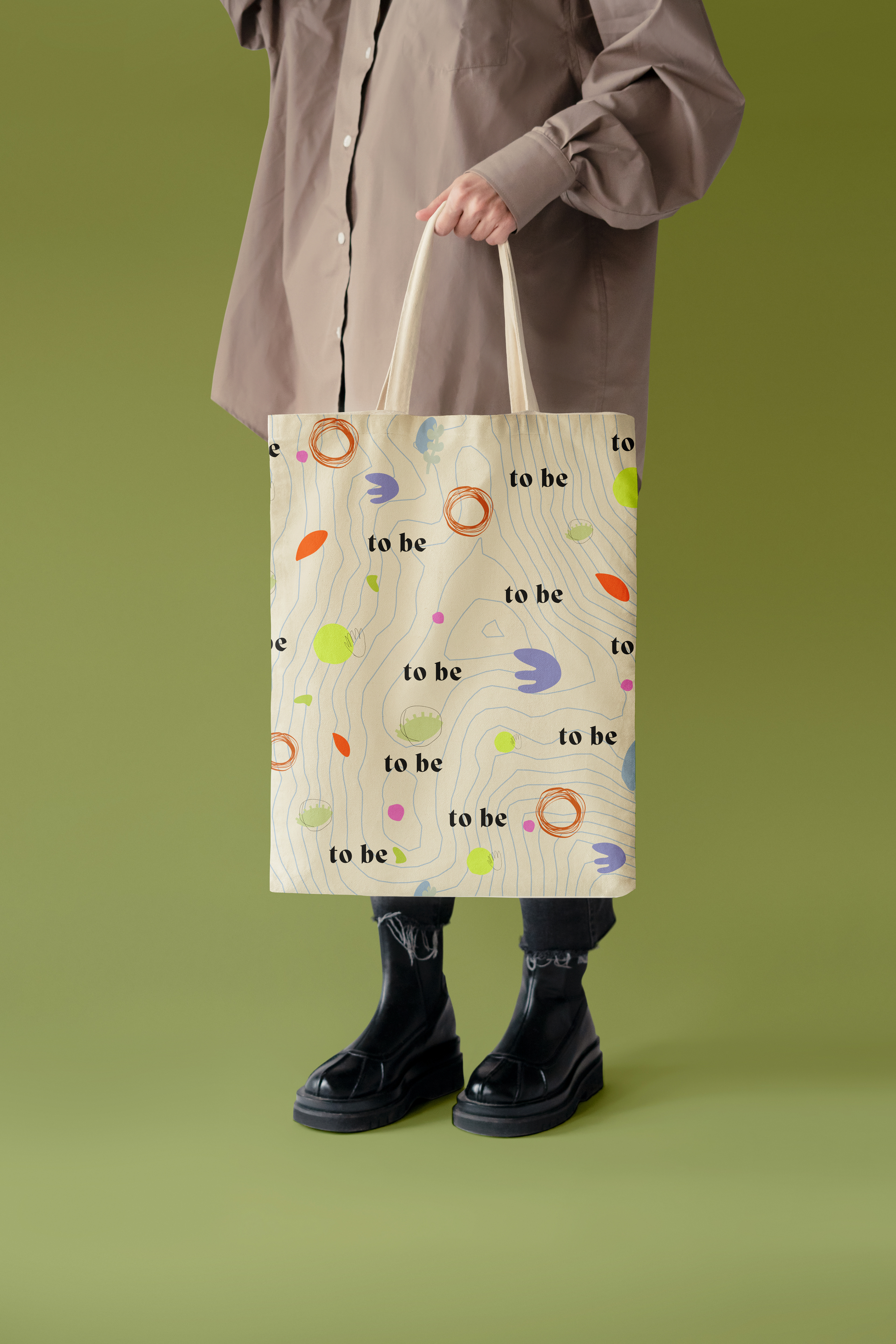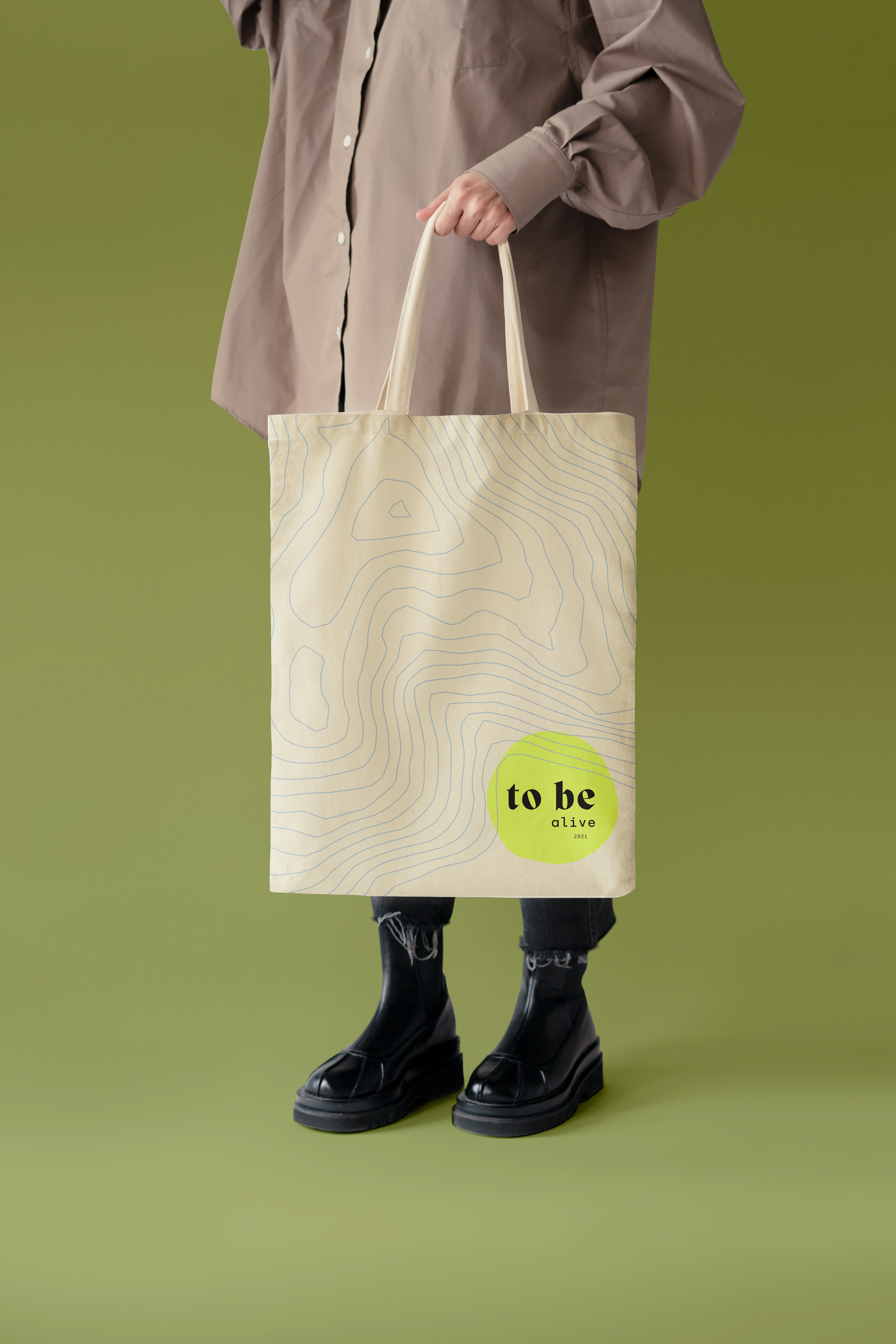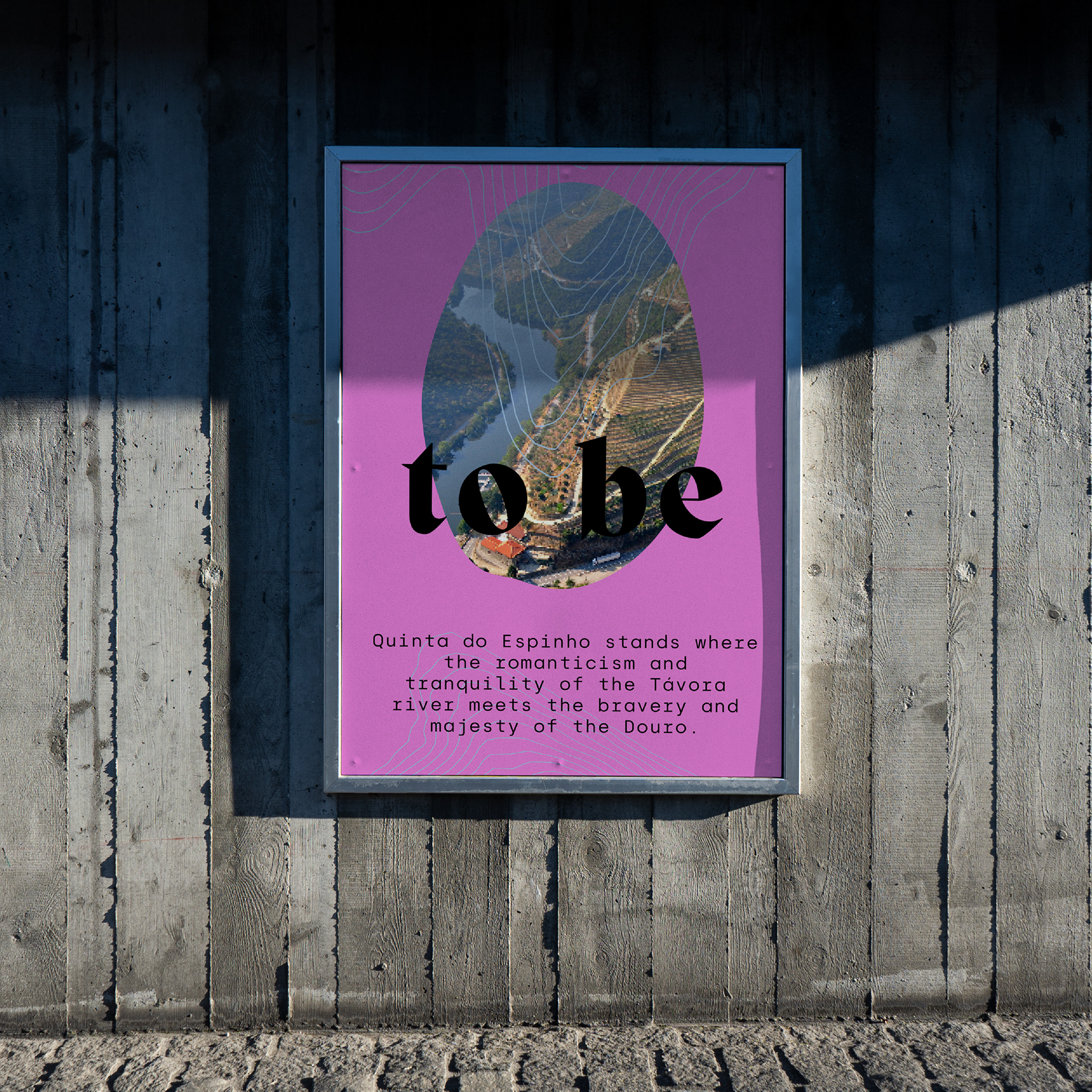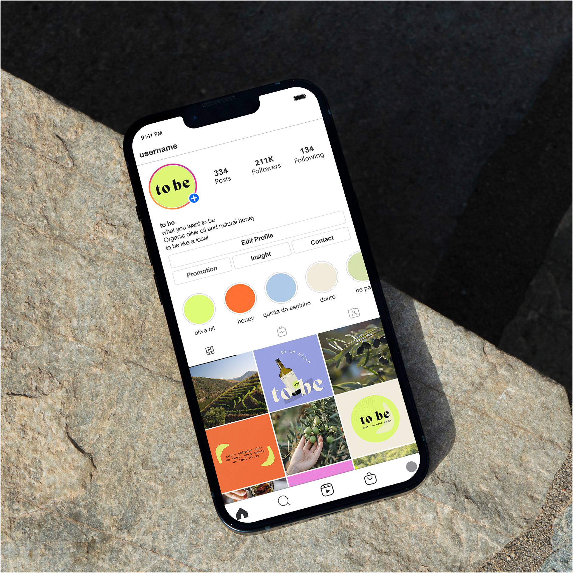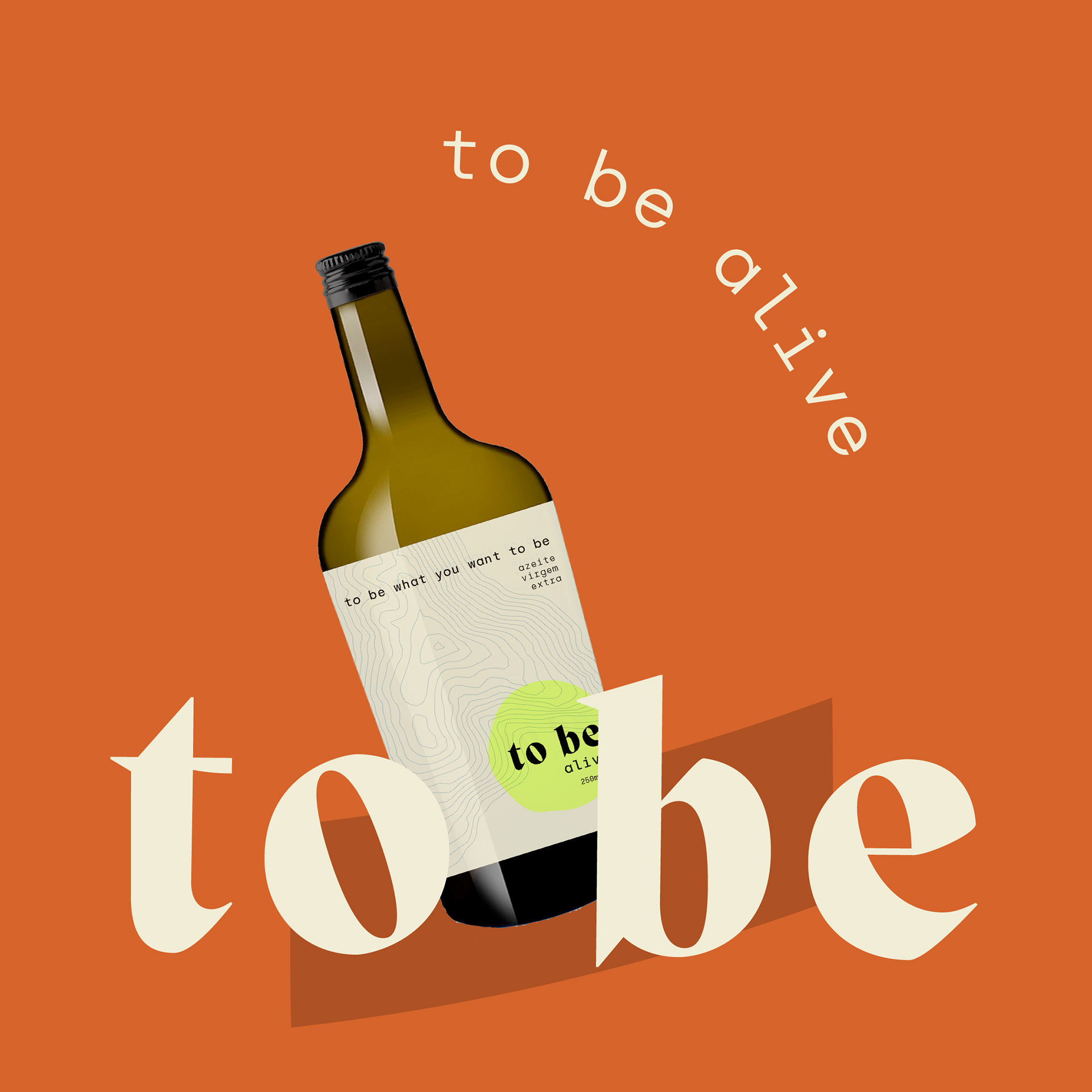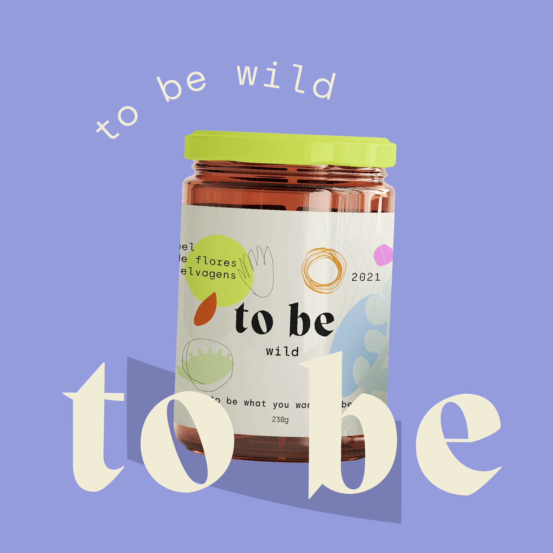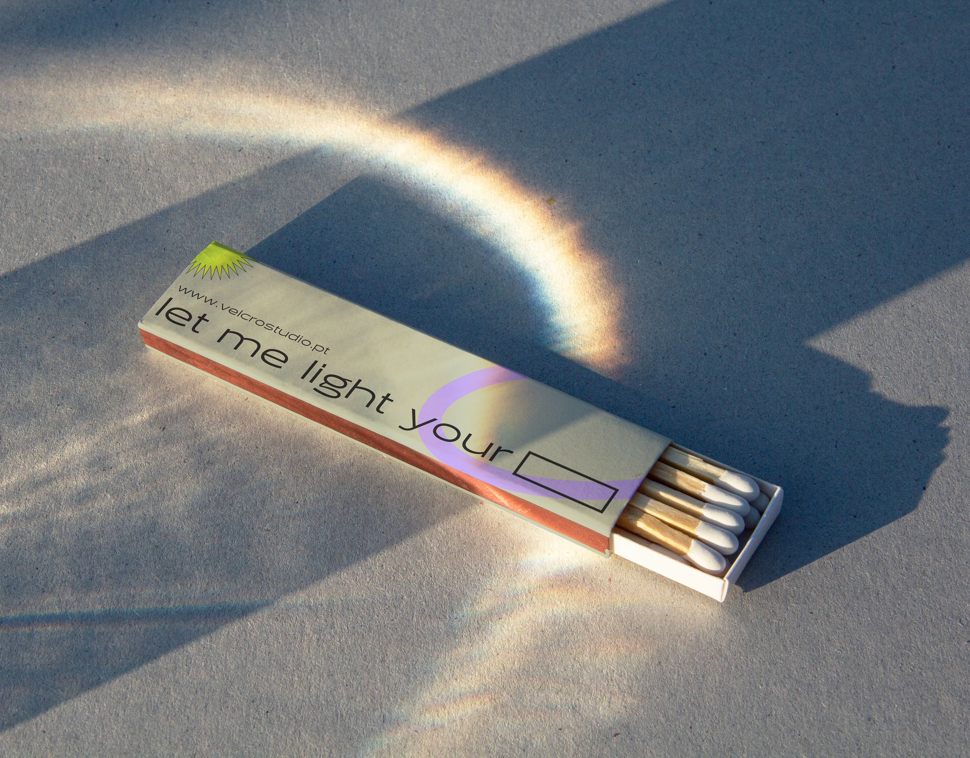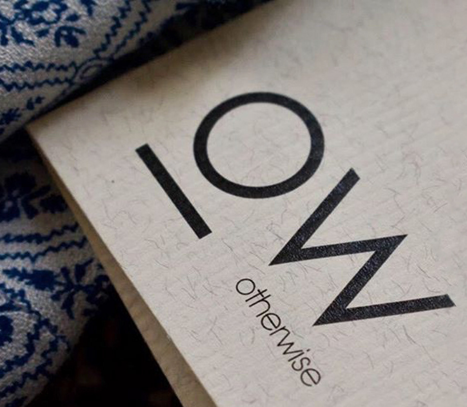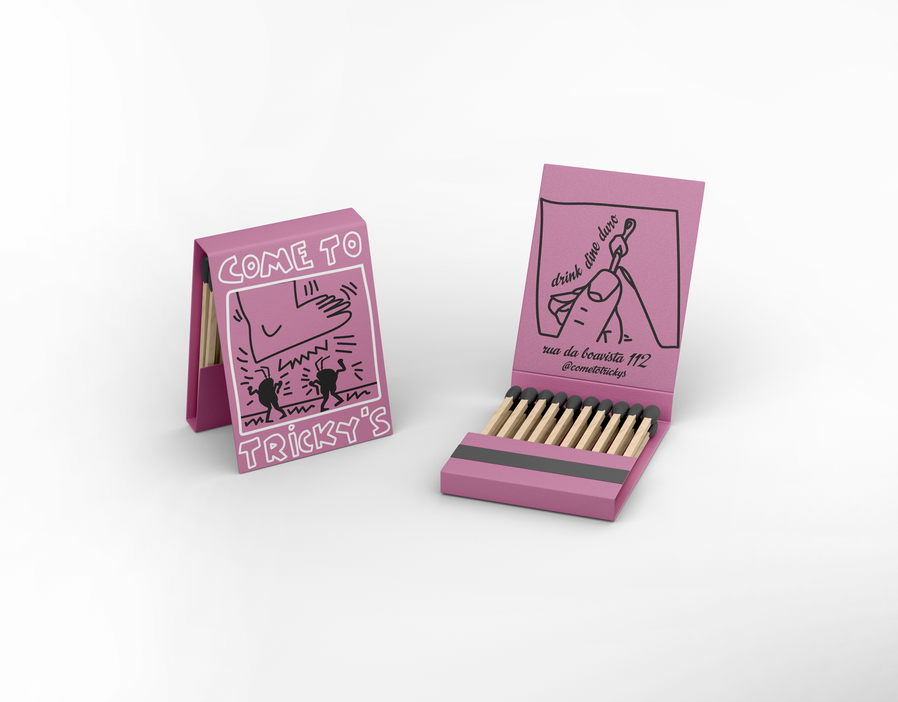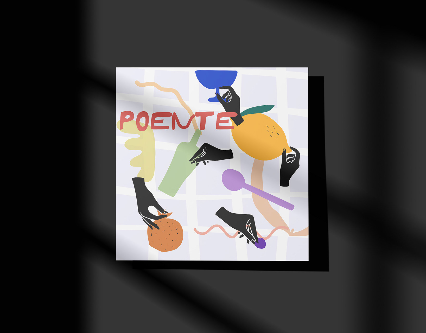
To Be was born from the desire to embrace life with intensity and passion. The brand crafts classic products with a modern edge, inspired by the raw beauty and organic forms of the Douro at Quinta de Espinho. Rooted in the land, the products and branding create a seamless connection between tradition and contemporary design. Edgy, bold colours bring a fresh, youthful energy, while retro-inspired typography ensures a timeless aesthetic.